Seeing Colour
Miguel Neiva is a designer from Portugal who has created a system which helps people who are colour blind to decipher colour.
When beginning his thesis dissertation in design and marketing at the University of Minho, Miguel Neiva was initially focused solely on the textile industry. Upon further research, Miguel realised that little is done in this industry to alleviate the constraints of colourblind individuals.
He then decided then to further explore the concept of 'inclusion' beyond his thesis and develop a complete coding system for the colourblind. Now the first fully licensed design of its kind, ColorAdd® has become a challenging and motivating project for the designer, who is currently working with a multidisciplinary team in Portugal to expand its reach.

About colour blindness
A colour vision deficiency, colour blindness is the inability to perceive differences between some of the colours that other can distinguish. Colour blindness is an inherited deficiency with no cure.
There are several types of colorblindness, the rarest being Monochromacy, which affects the perception of every color, resulting in a black and white or grey shaded vision. The most common type of color blindness is Trichromacy, which results in skewed interpretation of different shades of color. While a person with a normal vision may see up to 30000 colors, a colourblind person has his or her visual capability limited to 500 to 800 colours.
The vast majority of colourblind people have normal vision. However, this deficiency makes it impossible for those affected to perform certain everyday social and professional tasks.
Project background
Based on the notion of 'inclusion', ColorAdd® is a monochromatic graphic code that allows colourblind users  - representing about 10% of the world's population - to identify colors in situations where it is the determining factor in the decision-making, without dependence on third parties nor the discomfort of uncertainty.
The first phase of Miguel's project required much bibliographic research to define and understand colour blindness, its varieties and all the visual consequences of those affected. Furthermore, he approached medical experts to ulitise their experience in this field.
A study was conducted on a sample of colourblind people to identify their main difficulties concerning their colour blindness and the ways and methods used by them to lessen and overcome these obstacles. The results of the survey of 146 individuals showed the necessity of such a colour identification tool. 90% of the colorblind are forced to request assistance when buying clothes, more than 40% have felt a level of difficulty in social integration, and almost have 50% felt the embarrassment of choosing clothing that may not be the best. It is hard to imagine the psychological discomfort experienced upon a wrong interpretation of colors.
Colour is a key tool used healthcare, educational, transportation, computer and directional systems worldwide. Considering this, it is clear that a design brief, developed not for designers but for society in general, is indeed a significant contribution to social inclusion.
The colour code
The message of other coded systems, such as road signs, is easily read by colourblind and non-colourblind individuals alike. Thus, form was used to constitute the basis and support the construction of the representation of colour.

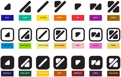
Given the universality of the colour system, with primary colours and secondary colours, this concept was adopted as the basis for the ColorAdd® system. Using primary colours, represented through simple symbols, the system was constructed through a process of logical association and direct comprehension. This makes understanding it very easy and allows a quick integration into the 'visual vocabulary' of the user, without having to memorise the symbols individually.
Its form allows the individual to simply connect the colours and their subsequent divisions with other colours through mixing simple forms combined with elementary chromatic combinations.
The system uses primary colours (CMYK), rather than the light colours (RGB) as the basis of the system. Each primary colour is associated to three forms representing blue (cyan), yellow and red (magenta).

The secondary colours can be formed using the basic forms as if 'mixing' the primary pigments themselves, making their perception and subsequently the composition of a colour pallet easy.

Two additional forms are added, representing black and white. Together with the elements they represent lighter or darker tones of the colours.

Given the simple characteristics of the system, its application requires an insignificant cost, and its adoption by various industries and society can improve the satisfaction and wellbeing of a group of individuals whose particular characteristics deprive them of a fully independent every-day experience.
Continue reading the full article at ICOGRADA

